
Today, Otto The Tag Auditor is a local scan-and-report tool. You point it at a site. You start a scan. Otto walks the pages. When the scan finishes, you open the report on your own computer.
You do not get a raw crawl dump. You get a marketer-facing health report with five tabs: Summary, Doing good, Need to watch, Need to fix, and Log. One score from 0 to 100 sits on that first screen. That is the current shape of the product.
I introduced Otto in Introducing Otto: agentic AI for marketing tag audits. The last published update was whether Google actually got the hit. This piece is about the report face marketers open after that check, not another walkthrough of the check itself.
What marketers see on the five tabs
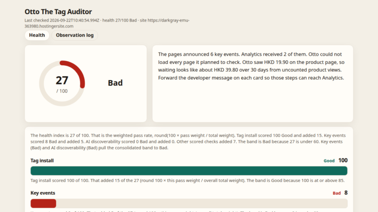
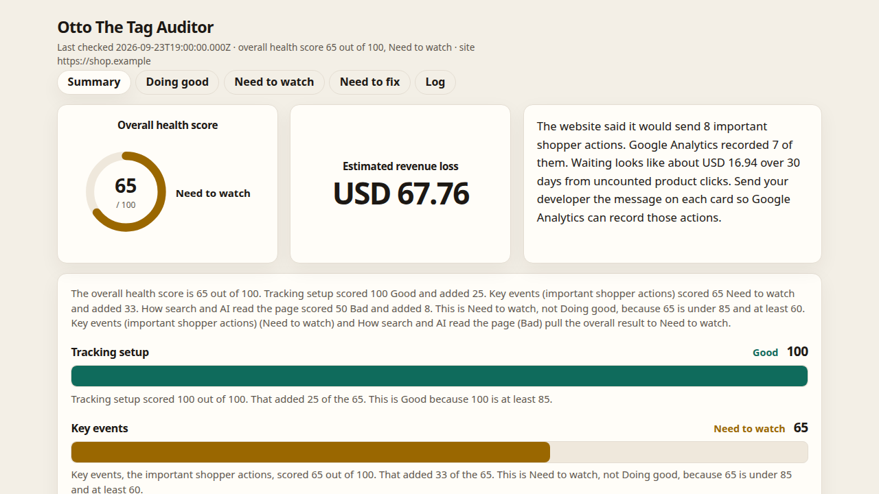
Summary is the first screen. It puts an overall health score on the left. The score runs from 0 to 100. Good means 85 or higher. Need to watch means under 85, and at least 60. Bad means under 60. When the scan has a loss figure, that figure sits in the middle as one large number, and a short summary sits on the right. On one sample run that middle number is USD 67.76. That figure is from that run. It is not a claim about every shop.
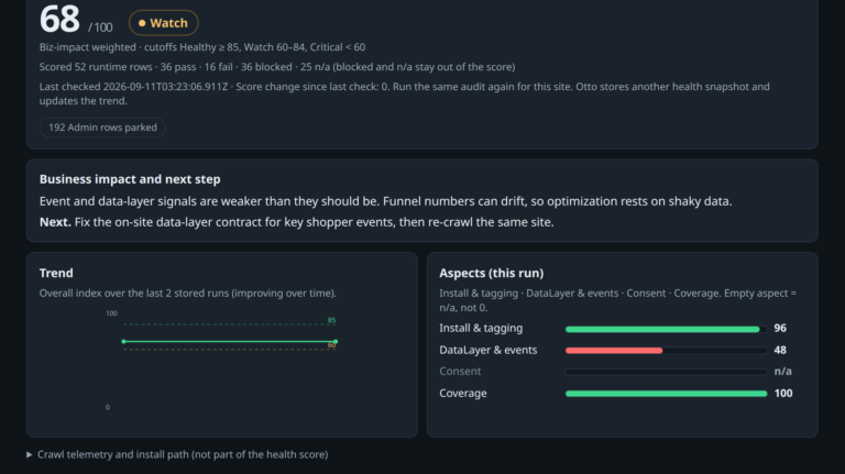
Under those cards you see three parts of the score. Tracking setup is how the tag is installed. Key events are the important shopper actions. How search and AI read the page checks the facts on the page, such as a product or a price. You also see the score over time, and a status grid: pages scanned, pages without tags, Doing good, Need to watch, Not present, and Need to fix. The first screen answers “how healthy is this?” before you dig into any row.
Doing good lists the shopper actions Google Analytics recorded. Those are the steps that landed. The columns are Tracking, Shopper action, and Page facts for search (the same three buckets on the next two tabs). Shared items collapse page addresses by default, so a marketer sees one working pattern instead of a wall of URLs.
Need to watch is where the gap shows without yet being a hard break. Soft items keep the page, the place on the page, a reason, and a suggestion. On one sample run, the key-events card says the score was 65 out of 100 because the website said it would send eight important shopper actions, and Google Analytics only recorded seven of them. That gap is why the result is Need to watch, not Doing good. The eight and the seven come from that run. They are not a claim about every shop. This tab answers “where is the gap?” without yet saying the site is broken.
Need to fix is where a problem shows, in those same three columns. Each item opens into nested detail: where it happened, the page, a fail shot when Otto has one, a suggestion, and a short copy a marketer can hand a developer. A double send (two accepted replies for one page open, or for one click) lands here. So does a purchase that is missing an order id, a currency, or a product. An order id is the number the shop gives that sale. The currency is the kind of money, such as dollars. The product is what the person bought. Google can accept the message and still leave the sale hard to trust when those pieces are missing. The earlier post covered how Otto proves a hit arrived. This tab is where that proof, and the thin cases next to it, show up as a fix list a marketer can act on.
Log gives one line for each thing Otto saw. The line has the time, the page, and a description in plain words. It is a short diary of the scan, not an engineering dump. When Summary feels too high-level and Need to fix feels too pointed, Log is the middle ground: what happened, in order.
Otto also saves a PowerPoint file next to the saved scan. The slides sit beside the same report for that run, so the same score and issues can leave the laptop as a short deck.
Why the five tabs matter
On 22 September I wrote that Otto could check those messages and write a health report. The report you open today has a shape. Summary answers “how healthy is this?” Doing good answers “what landed?” Need to watch answers “where is the gap?” Need to fix answers “what is broken?” Log answers “what did Otto see, line by line?”
That is the current situation for marketers who open Otto after a scan: one local report, five tabs, one score from 0 to 100, a loss figure when the scan has one, and a clear place for the gap between what the site said it would send and what Google Analytics recorded.
If you own tagging, what should the first screen after a scan tell you?